

Neuromarketing, Digital Psychology, Emotional Content & Influential Interactive Design Review
Neuromarketing, Digital Psychology, Emotional Content & Influential Interactive Design Review
Part 4 of 12 of the Conversion Optimisation series

This is the fourth in a series of twelve blog posts about conversion optimisation, as I review the minidegree of the same name by CXL Institute.
This instalment 4 of 12 is all about Neuromarketing, Emotional Content Strategy, and Influential Interactive Design.
Look out! 👀 for these:
🔑🥡 = Key takeaways
Nurses came out on top at 85% .
Engineers, my chosen profession, did pretty well on 70%.
Marketers, not so good at a mere 11%.
Sales people did even worse getting only 8%.
Another survey asked people what professions they trusted.
Doctors in that survey came out on top with 49%.
Firefighters not far off with 48%.
Marketers, just 3% were trusted.
Politicians the worst at 1%.
It's not just regular people who distrust marketers, another survey asked CEO's about their C level executives and whether these executives were competent to do their job;
90% had pretty much full faith in their CFOs.
90% CIOs.
Only 20% CMOs.
That's a pretty scary statistic. Only 1 in 5 CEOs trust their CMOs!
🔑🥡 Never believe A/B test case studies!
They only show a part of the truth. Without absolute numbers it’s untrustworthy.
Something that you can’t see can’t change the behavior of your users. Test stuff that has the power to fundamentally change user behavior.
Statistical significance is not validity – don’t stop the test once you reach 95% significance. Make sure you have enough sample size and long enough test duration.
Your website is a salesperson, understand the biases that you can use –List of cognitive biases
Growth System = Goals + Ability + Culture
The Persuasion Slide Framework

Based on a children's playground slide it attempts to incorporate persuasion psychology with four simple components:
Gravity: Customers initial motivation (needs, wants, goals)
Fighting gravity: Asking customers to do work
Working with gravity: Helping customers do what they need
Nudge: Get attention, start persuading (phone call, email, popup, CTA)
Angle: Motivation you provide;
Conscious (expensive): Benefits, price, specs, etc.
Unconscious (free): Emotions, biases, etc.
Friction: Difficulty (real and perceived)
🔑🥡 If it’s not motivation, it’s friction!
🔑🥡 Regardless of how rational we may consider ourselves to be, every decision is ultimately informed by emotion.
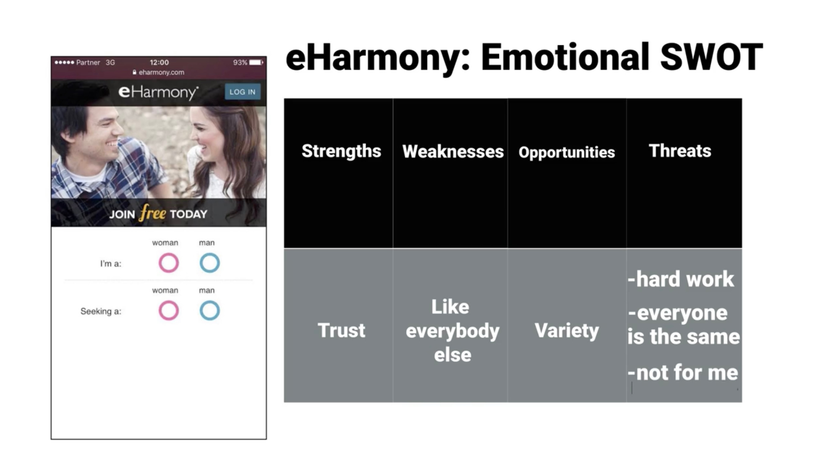
Talia Wolf’s 4 step process for Developing & Testing an Emotional Content Strategy includes:
Emotional Competitor Analysis
Emotional SWOT
Building an Emotional Content Strategy
Testing
“It's not about the coffee ☕️ that you're drinking and it's not about the shoes 👠 that you're wearing.It's about how you feel while you're wearing these shoes.”
Questions she asks:
How similar to our competitors do we want to be?
Which emotional targeting approaches should we be looking for in our competitors?
How do we recognize them?
Is it better to take an emotional risk in order to stand out?
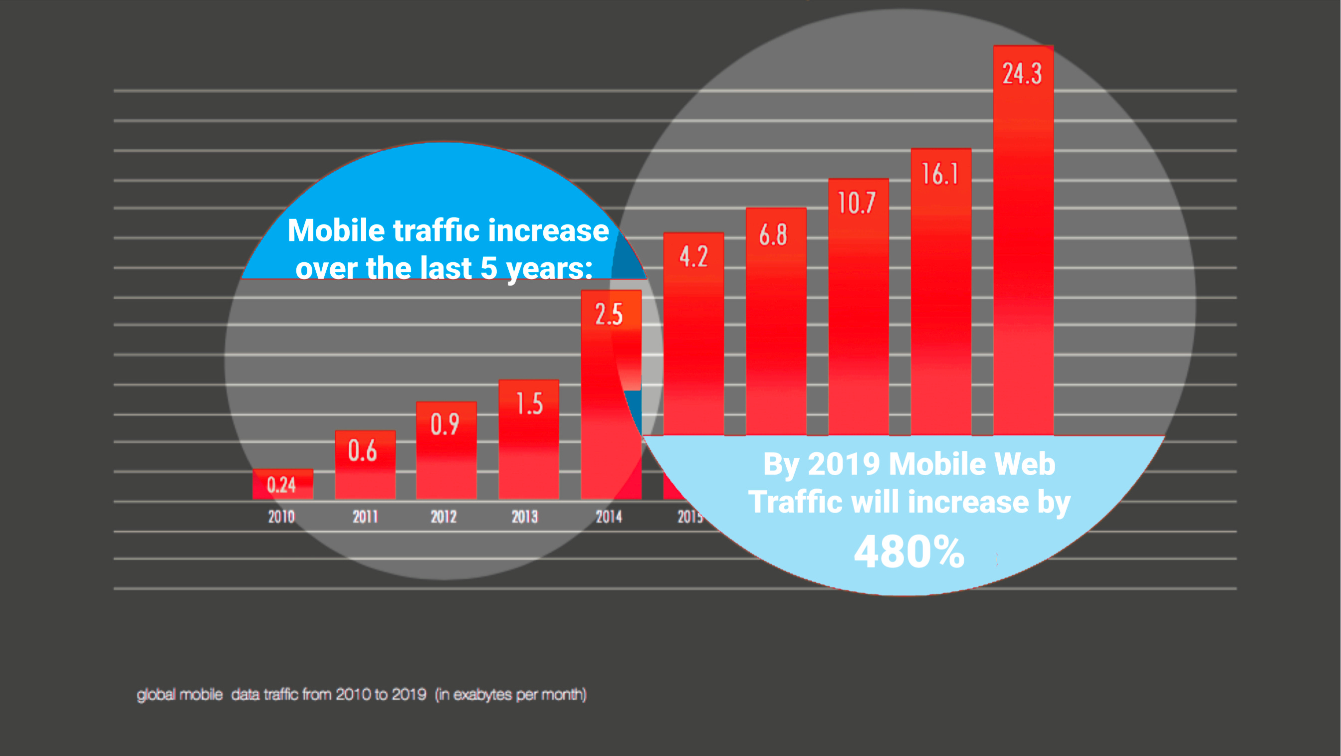
If the average user checks their mobile phone 150 times a day, then why are conversion rates 270% higher on desktop?
🔑🥡 Responsive design KILLS conversions! —Design specifically for mobile!
There is an enormous gap in conversion rate between desktop and mobile, likely due to the multitasking and on-the-go nature of these transactions. However, mobile traffic is projected to grow 480% in the next 5 years.

🔑🥡 There are over 223 different emotional triggers you can use within your landing pages!

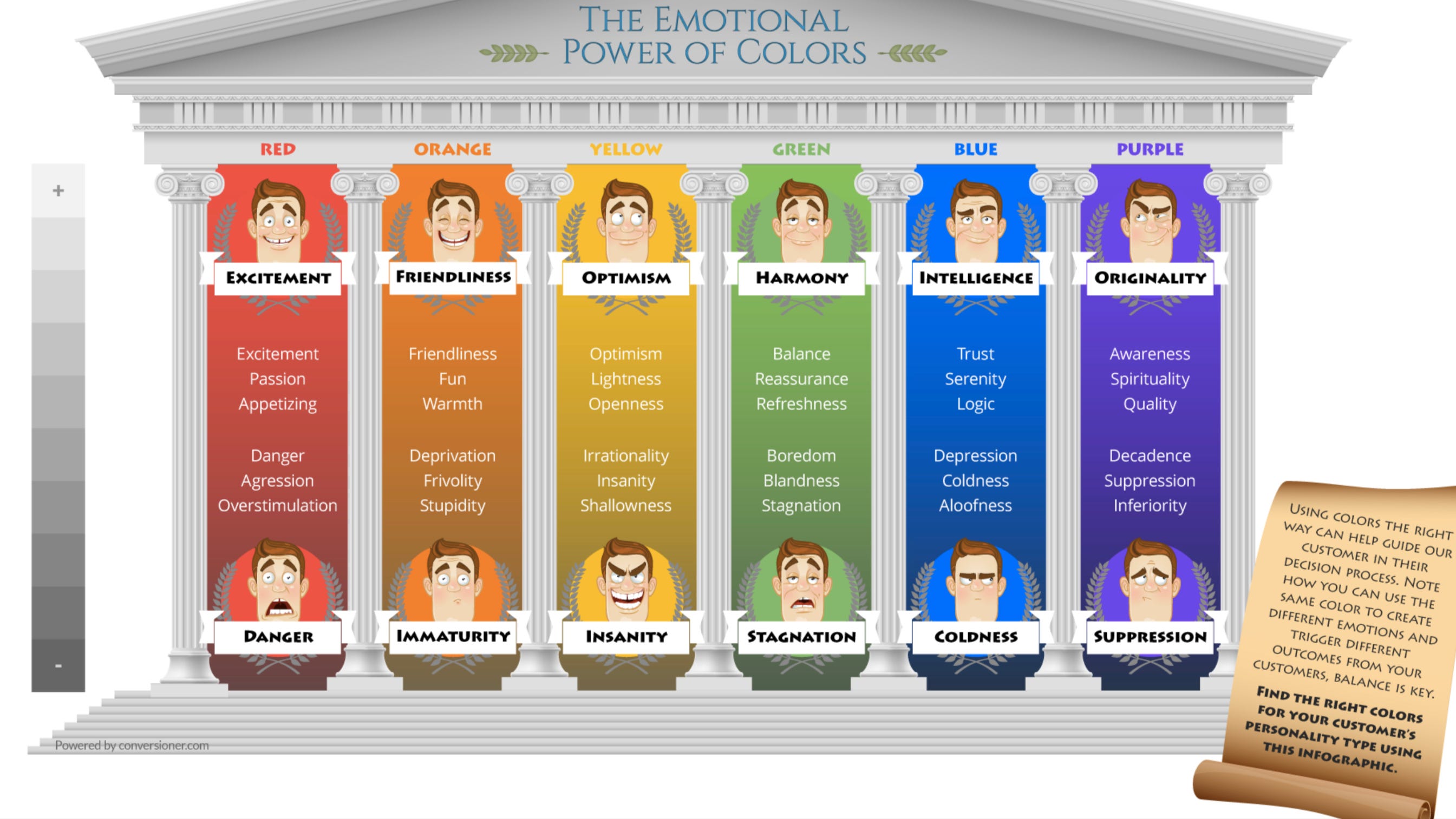
Colours have an emotional affect on us!
Interactive Design
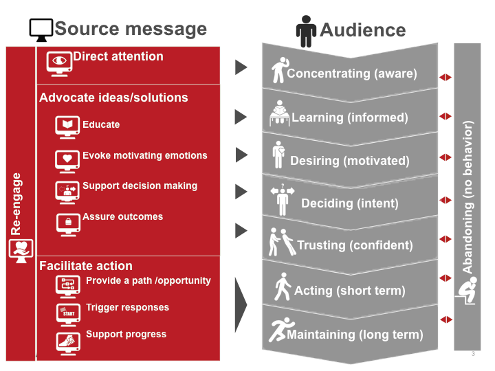
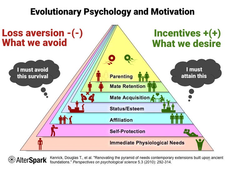
Before any design principles come into play, you should be able to define your intended consumer outcomes. Dr. Cugelman’s framework breaks down a typical behavioral flow with roots in evolutionary psychology.
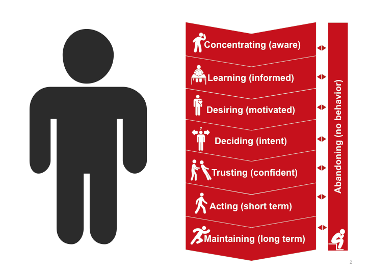
The other half of the framework: the design strategies that lead you there.
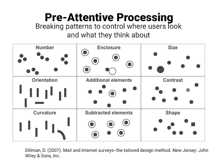
Pre-attentive processing: a design tactic which directs viewers attention by manipulating patterns.
🔑🥡 Old adage; "Features tell, but it's the benefits that sell."
“…we have to make surethat our target audience at least hasa basic cognitive understandingof what we're offering.For some people, that won't be as important.We might get them on the benefits.But you will lose a lot of people'cause they might look at what you're offeringand say that's just marketing hype.Your customers are pretty smartand a lot of them are savvyand they've been exposed to a lot of marketing.Show 'em what it is, give 'em the facts.”
This framework motivates positively and negatively via loss aversion and incentivising.
This template, created by Dr. Cugelman, will quickly gauge your website’s influence efficacy. Each question corresponds with the outcome stages outlined in his framework.
This quick test can serve both as a guide for self-assessment during the design process as well as a survey template for guerilla research.
Show a screenshot of your page for 5-10 seconds and ask participants to answer these questions:
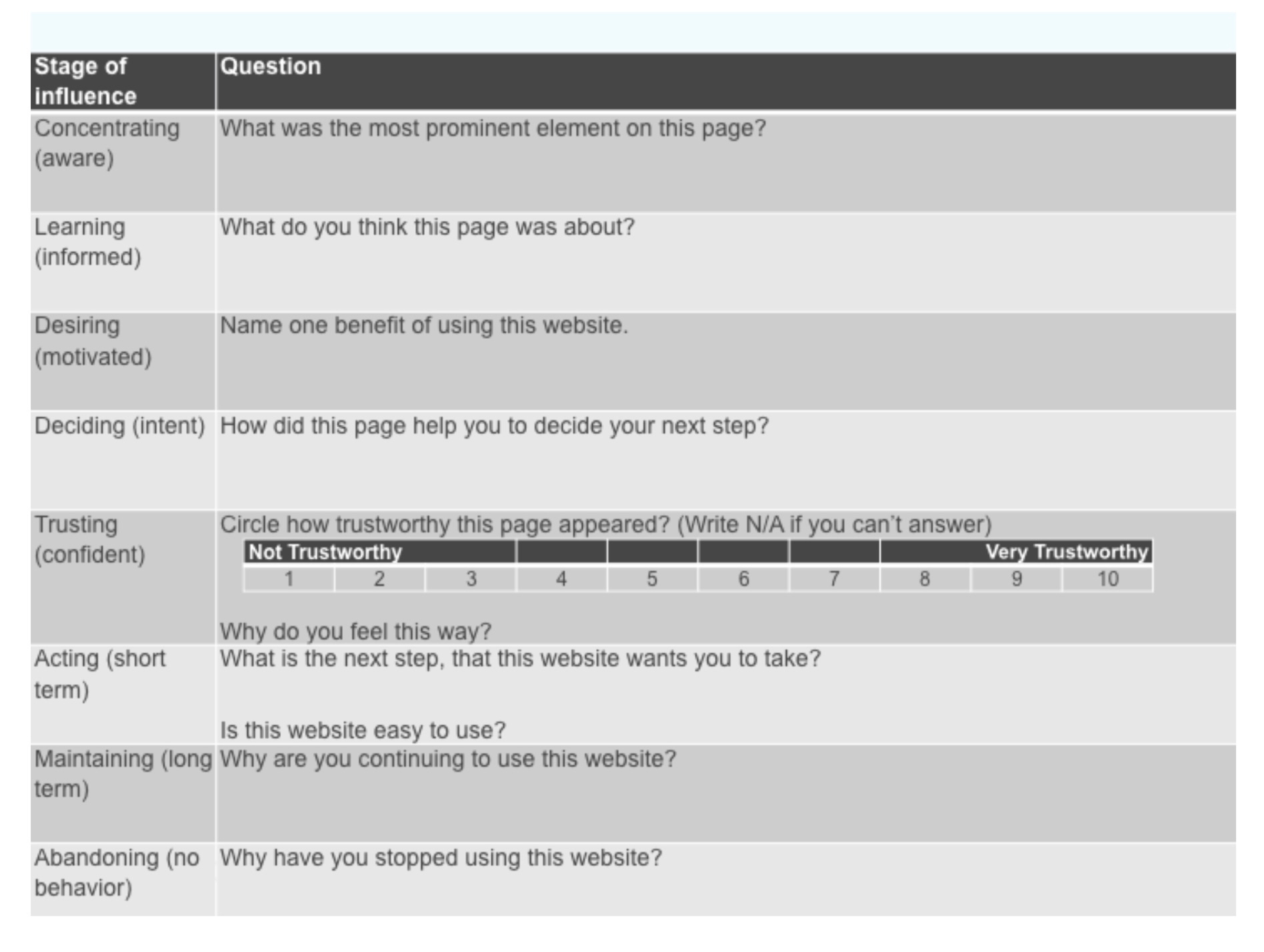
This is what you should be hoping to hear:
Concentrating: It’s ideal for the audience to say the most prominent element is something tied to the product you’re offering. Oftentimes many fancy graphics and creative concepts don’t translate, which you will discover at this stage.
Education: Here you can make sure the audience understands the concept of the offering. Even if it is OK if it’s a little fuzzy or vague, you’re still on track.
Motivation: Ideally the “benefit” they name is aligned with your value prop.
Decision Making: This one tends to give more mixed responses, but ideally the audience would pinpoint a pricing table or similar feature and explain how it swayed their inclination to buy.
Trusting: Here it’s important to correct any areas of low trust. Use this feedback to figure out if you have a backfire that’s discrediting yourself, or if you forgot to put something in.
Acting: This is to gauge clarity in communicating your path.
The last two may not apply to a flash test, but are important to consider along with the outcomes. Feedback is difficult to come across with users who have stopped returning. However, the rare responses you get will be immensely valuable, so pop up surveys and similar pursuits are worthwhile.
How people conceptualise virtual space
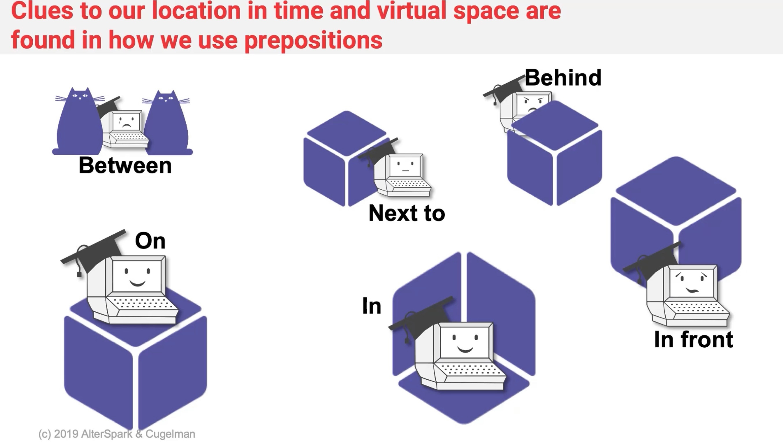

We help people navigate software using metaphors of the real world. Information architecture originated from libraries and how books were organised to be easy to find. This is used in software as it seems intuitive and natural. It is what people are used to. But these are all just abstractions to help the user do what you want them to do.

Remember: This was just 4 of 12 in my series on CRO. Make sure to check out the others coming each week!